2024
TaskCRM
randomsite.co
Background
Taskflow was an innovative SaaS platform aiming to streamline project management for small teams. They approached me to design a user-centric interface that would appeal to both novice and experienced users. With a focus on simplicity, I was tasked with making the product intuitive without sacrificing its powerful features.
Core problem
The platform was feature-rich but lacked cohesion. The user journey was fragmented, and core functionalities were hidden deep within menus, leading to a steep learning curve for new users.
Crafting a User-Centered Approach
We kicked off the project by conducting user research and identifying pain points. The feedback revealed that users struggled with navigation and found the interface overwhelming.
Restructuring the Information Architecture
I collaborated closely with the product team to overhaul the navigation. We grouped features into more intuitive categories and introduced a sidebar for quick access to frequently used tools.
Redesigned the dashboard to display key metrics upfront
Created a more logical user flow, reducing the number of clicks to complete tasks
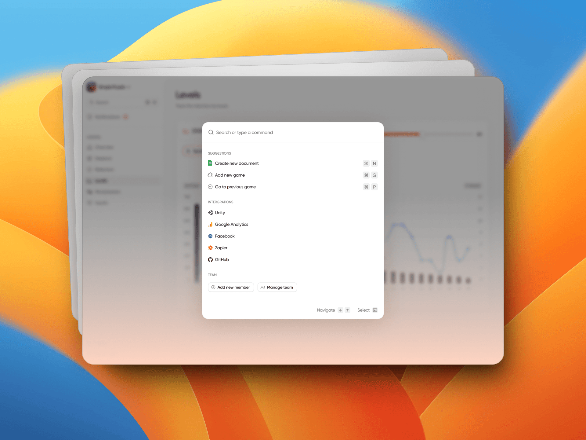
Implemented a search function to help users find tools faster
Enhancing Visual Hierarchy
To improve usability, I employed a minimalistic design with a clear hierarchy. Color coding and typography were used to differentiate between primary and secondary actions.
Designed a color scheme that visually guides the user
Applied consistent typography for clarity across the platform
Integrated subtle animations to highlight transitions and actions
Results and Impact
The redesign significantly reduced the time users spent on tasks, resulting in a 25% increase in user retention and a 40% decrease in customer support tickets. The platform became more approachable for new users, contributing to a 15% growth in the user base within three months.


