2024
Nexa Inc.
randomsite.co
Background
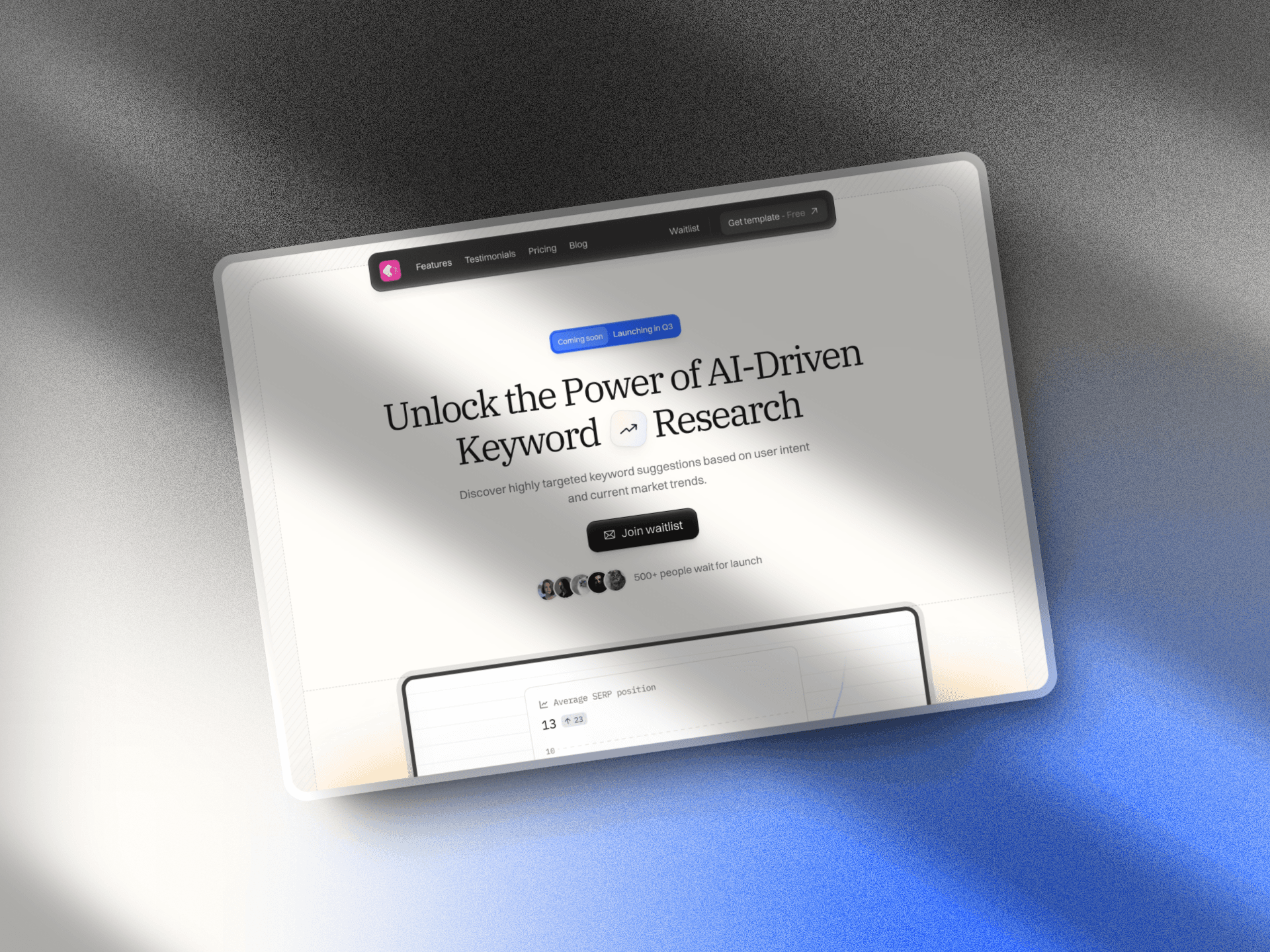
NexaTech, a growing SaaS company offering data-driven solutions for logistics management, sought to elevate their web presence to better reflect their tech-forward approach. They needed a complete overhaul of their online platform to increase user engagement, simplify complex content, and align with their evolving brand identity.
Core problem
The existing website for NexaTech lacked intuitive navigation, with a design that didn’t clearly communicate the technical sophistication of the product. The UX was cluttered, leading to high bounce rates, and the overall look felt outdated compared to their competitors.
Approach & Process
Research and Discovery
We began by conducting user interviews and analyzing site traffic data to understand what content users found confusing or inaccessible. This provided insights into customer pain points, which informed our design and functionality decisions.
Design and Development
We focused on building an interface that delivered both functionality and a sleek, modern look.
Streamlined Navigation: We restructured the navigation to allow users to easily access product features and case studies.
Visual Hierarchy: By introducing a clear typography system, we ensured that complex data was presented in a digestible manner.
Responsive Design: A mobile-first approach was implemented, ensuring seamless user experience across all devices.
Consistent Brand Aesthetic: We integrated NexaTech's new branding into the web design, using a cohesive color palette, custom icons, and dynamic illustrations.
Key Features
User-centric navigation
Optimized mobile experience
Enhanced data visualization
Clean, minimalistic design with custom elements
Results and Impact
The redesigned NexaTech website increased session durations by 30% and significantly reduced bounce rates. The clear, focused user journey helped the company see a 20% rise in new customer inquiries within the first three months post-launch.


